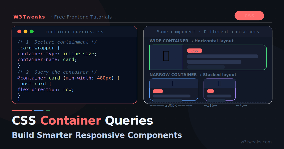
For years, CSS developers faced an awkward problem: a card component in a wide main column needs three columns of content, but the same card in a narrow sidebar needs a single stacked column. Media queries could not help — they only know about the viewport width, not where the component actually lives on the page.
Container queries solve this. They let a component respond to the size of its parent container rather than the browser window. The same card can be wide in a large container and compact in a small one — with zero JavaScript and zero media query hacks.
Container queries are now Baseline — supported in all modern browsers since late 2023. They are production-ready and actively changing how developers write CSS.
How Container Queries Work
The concept is simple: you declare an element as a containment context, then write queries that fire based on that container’s size.
/* Step 1: Declare a containment context */
.card-wrapper {
  container-type: inline-size;
}

/* Step 2: Query the container inside the component */
@container (min-width: 400px) {
  .card {
    display: flex;
    flex-direction: row;
  }
}
When .card-wrapper is wider than 400px, the card lays out horizontally. When it is narrower, the card stacks. This works no matter where .card-wrapper appears on the page.
The Three container-type Values
/* Responds to inline-size (width) only — most common */
.wrapper { container-type: inline-size; }

/* Responds to both width AND height — use sparingly */
.wrapper { container-type: size; }

/* Creates a containment context but no queries — rarely needed */
.wrapper { container-type: normal; }
inline-size is what you will use 95% of the time. It enables width-based queries without the performance cost of height containment.
Naming Containers
When you have nested containers, name them to target the right one:
.page-layout {
  container-type: inline-size;
  container-name: layout;
}

.sidebar {
  container-type: inline-size;
  container-name: sidebar;
}

/* Targets the sidebar container specifically */
@container sidebar (min-width: 280px) {
  .widget { flex-direction: row; }
}

/* Targets the page layout container */
@container layout (min-width: 900px) {
  .main-content { columns: 2; }
}

/* Shorthand */
.sidebar {
  container: sidebar / inline-size;
}
Your First Real Component
A post card that adapts between a compact stacked layout and a wide horizontal layout:
<div class="card-container">
  <div class="post-card">
    <div class="card-image">
      <img src="thumbnail.jpg" alt="Post thumbnail">
    </div>
    <div class="card-body">
      <span class="card-tag">CSS</span>
      <h2 class="card-title">CSS Grid and Flexbox: Complete Guide</h2>
      <p class="card-excerpt">Everything you need to know about modern CSS layout.</p>
      <div class="card-meta">
        <span class="card-author">W3Tweaks Team</span>
        <span class="card-date">May 22, 2026</span>
      </div>
    </div>
  </div>
</div>
/* Containment context on the wrapper */
.card-container {
container-type: inline-size;
}
/* Default: stacked (mobile-first) */
.post-card {
display: flex;
flex-direction: column;
background: #161c2d;
border: 1px solid rgba(255,255,255,.08);
border-radius: 12px;
overflow: hidden;
}
.card-image img {
width: 100%;
height: 200px;
object-fit: cover;
}
.card-body {
padding: 16px;
display: flex;
flex-direction: column;
gap: 10px;
}
.card-excerpt { display: none; }
/* When container is wide enough: go horizontal */
@container (min-width: 480px) {
.post-card {
flex-direction: row;
}
.card-image {
width: 200px;
flex-shrink: 0;
}
.card-image img {
width: 100%;
height: 100%;
}
.card-excerpt {
display: block;
}
}
/* When container is really wide: three-column body */
@container (min-width: 700px) {
.card-image { width: 280px; }
.card-body {
display: grid;
grid-template-columns: 1fr auto;
grid-template-rows: auto 1fr auto;
gap: 8px 16px;
}
.card-tag { grid-column: 1; grid-row: 1; }
.card-title{ grid-column: 1 / -1; grid-row: 2; font-size: 22px; }
.card-excerpt { grid-column: 1; grid-row: 3; }
.card-meta { grid-column: 2; grid-row: 1; text-align: right; }
}Now place .card-container anywhere — in a full-width section, a 300px sidebar, or a modal — and the card adapts automatically.
Container Query Units
Container queries introduce four new CSS units that are relative to the container size:
@container (min-width: 400px) {
  .card-title {
    /* cqw — 1% of container width */
    font-size: clamp(16px, 4cqw, 28px);

    /* cqh — 1% of container height */
    min-height: 10cqh;

    /* cqi — 1% of container inline size */
    padding: 2cqi;

    /* cqb — 1% of container block size */
    margin-bottom: 1cqb;

    /* cqmin / cqmax — smaller/larger of cqi and cqb */
    border-radius: 1cqmin;
  }
}
cqw and cqi are the most useful — they let you scale typography and spacing proportionally to the container, not the viewport. This is the CSS equivalent of fluid typography but component-scoped.
Practical Use Case: Navigation Component
A navigation bar that collapses to icons-only when in a narrow container:
.nav-container {
  container: nav / inline-size;
}

.nav-list {
  display: flex;
  align-items: center;
  gap: 4px;
  list-style: none;
}

.nav-item a {
  display: flex;
  align-items: center;
  gap: 8px;
  padding: 8px 12px;
  border-radius: 8px;
  color: #7a90b8;
  text-decoration: none;
  transition: all .15s;
}

.nav-item a:hover {
  background: rgba(255,255,255,.07);
  color: #f0f6ff;
}

/* Hide text labels in narrow containers */
@container nav (max-width: 200px) {
  .nav-label { display: none; }
  .nav-item a { padding: 8px; justify-content: center; }
}

/* Show labels and arrange horizontally in wider containers */
@container nav (min-width: 201px) {
  .nav-label { display: inline; }
}
The same nav component works in a collapsed sidebar, a wide header, or a mobile drawer — all without media queries.
Practical Use Case: Data Dashboard Widget
A stats widget that rearranges based on available space:
.widget-container {
  container: widget / inline-size;
}

.stats-widget {
  background: #161c2d;
  border: 1px solid rgba(255,255,255,.08);
  border-radius: 12px;
  padding: 16px;
}

/* Compact: number above label */
.stat-item {
  display: flex;
  flex-direction: column;
  align-items: center;
  text-align: center;
  gap: 4px;
}

.stat-number {
  font-size: 2rem;
  font-weight: 800;
  color: #f0f6ff;
}

.stat-label {
  font-size: 0.75rem;
  color: #546e8a;
  text-transform: uppercase;
  letter-spacing: .08em;
}

/* Medium widget: show multiple stats in a row */
@container widget (min-width: 320px) {
  .stats-widget {
    display: flex;
    gap: 0;
  }

  .stat-item {
    flex: 1;
    border-right: 1px solid rgba(255,255,255,.06);
    padding: 0 16px;
  }

  .stat-item:last-child { border-right: none; }
}

/* Large widget: inline number + label + trend */
@container widget (min-width: 520px) {
  .stats-widget { gap: 0; }

  .stat-item {
    flex-direction: row;
    align-items: center;
    text-align: left;
    gap: 12px;
  }

  .stat-number { font-size: 2.5rem; }

  .stat-trend { display: block; } /* hidden by default */
}
Container Queries vs Media Queries
Understanding when to use each:
| Scenario | Use |
|---|---|
| Full-page layout changes (header, main, sidebar) | Media query |
| Component behaviour based on its available space | Container query |
| A card that appears in multiple contexts | Container query |
| Body font size based on viewport | Media query |
| Typography inside a component | Container query + cqw |
| Hiding navigation on small screens | Either, depends on architecture |
The rule of thumb: if you are styling the page shell, use media queries. If you are styling a reusable component, use container queries.
They are complementary — use both in the same stylesheet:
/* Page shell responds to viewport */
@media (min-width: 768px) {
  .layout {
    grid-template-columns: 280px 1fr;
  }
}

/* Components respond to their container */
@container (min-width: 400px) {
  .post-card {
    flex-direction: row;
  }
}
Style Queries
Container queries also support style queries — querying the computed CSS value of a custom property on the container:
/* Set a custom property on the container */
.card-wrapper {
  container-type: inline-size;
  --card-theme: dark;
}

/* Query it inside the component */
@container style(--card-theme: dark) {
  .post-card {
    background: #161c2d;
    color: #c4d4ed;
  }
}

@container style(--card-theme: light) {
  .post-card {
    background: #ffffff;
    color: #1a1a1a;
  }
}
This lets you change component themes by flipping a single custom property on the container — no class toggling, no JavaScript.
Browser support note: Style queries are supported in Chrome 111+ and Safari 17.2+. Firefox support arrived in version 129. Check caniuse.com/css-container-queries-style before using in production.
Common Gotchas
1. The container cannot query itself
The container-type must be on a parent of the component you are styling. The component cannot query its own container.
/* ❌ Wrong — .card cannot query itself */
.card { container-type: inline-size; }
@container (min-width: 400px) { .card { ... } }

/* ✅ Correct — wrapper queries affect the child */
.card-wrapper { container-type: inline-size; }
@container (min-width: 400px) { .card { ... } }
2. Containment creates a new stacking context
Elements with container-type other than normal create a new stacking context, similar to position: relative. This can affect z-index layering.
3. container-type: size requires explicit dimensions
If you use size (not inline-size), the container needs an explicit height — otherwise content collapses. Stick to inline-size unless you specifically need height queries.
4. No em units in container query conditions
Container query breakpoints use px — em and rem units in the query condition itself are not supported in all browsers yet.
/* ✅ Works everywhere */
@container (min-width: 400px) { ... }

/* ⚠ Avoid in query conditions — inconsistent support */
@container (min-width: 25em) { ... }
Browser Support
Container queries (inline-size) are Baseline — supported in:
- Chrome 105+
- Firefox 110+
- Safari 16+
- Edge 105+
This covers 93%+ of global users as of 2026. You can use container queries in production without a polyfill.
For the remaining users on older browsers, the fallback is simply the default styles you wrote before the @container block — which should be your mobile-first stacked layout.
Key Takeaways
- Container queries respond to the parent element size, not the viewport — this makes components truly portable
- Declare
container-type: inline-sizeon the wrapper, not the component itself - Name containers with
container-namewhen nesting to avoid ambiguity - Use
cqw,cqi, andcqbunits for fluid sizing relative to the container - Style queries let you switch component themes via CSS custom properties alone
- Container queries and media queries are complementary — use media queries for page layout, container queries for components
- Browser support is production-ready at 93%+ global coverage — no polyfill needed