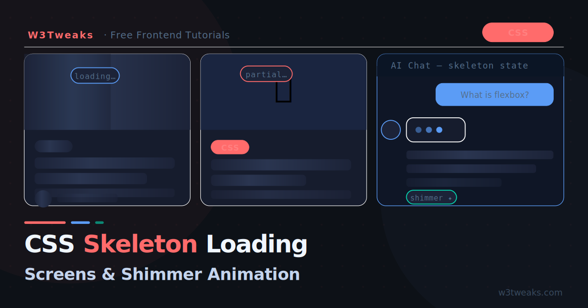
Every AI product you use today — ChatGPT, Claude, Gemini, Perplexity — shows a skeleton loading state while it thinks. Instead of a blank screen or a generic spinner, you see ghosted placeholder shapes that hint at the content about to appear. It feels fast. It feels intentional. Users trust it.
Skeleton screens are not just an AI trend. They are the modern standard for any content that loads asynchronously — social feeds, product cards, dashboards, article pages. And the good news: they are entirely a CSS technique. No JavaScript required.
This tutorial covers everything from a basic shimmer effect to production-ready skeleton components for cards, articles, and AI chat interfaces.
Why Skeleton Screens Beat Spinners
Before writing any code, it helps to understand why skeleton screens work so well psychologically.
A spinning loader gives users no information about what is coming. It creates anxiety — is this loading quickly or slowly? Is the content text or images? Will it be one item or twenty?
A skeleton screen answers all of these questions silently. The placeholder shapes tell users: this is a card with an image on top, a headline, and two lines of description. The content is coming. The page is alive.
Research consistently shows skeleton screens feel faster than spinners even when load times are identical. The perceived wait is shorter because the brain has something to process.
The Core Technique: CSS Shimmer Animation
The skeleton effect comes from two things working together:
- Placeholder shapes — grey blocks that mirror the layout of the real content
- Shimmer animation — a diagonal light sweep that signals activity
The shimmer is created with an animated linear-gradient on a background property, moving from left to right using background-position.
.skeleton {
  background: #e2e8f0;
  background-image: linear-gradient(
    90deg,
    #e2e8f0 0px,
    #f8fafc 40px,
    #e2e8f0 80px
  );
  background-size: 300px 100%;
  background-repeat: no-repeat;
  animation: shimmer 1.5s infinite linear;
  border-radius: 4px;
}

@keyframes shimmer {
  0%   { background-position: -300px 0; }
  100% { background-position: calc(100% + 300px) 0; }
}
The gradient is a narrow bright stripe (40px wide) that travels across the element. By animating background-position from far left to far right, you get the sweeping shimmer effect with a single CSS property — no JavaScript, no Canvas, no WebGL.
Building a Card Skeleton
The most common use case. A skeleton card that matches the layout of a real content card:
<div class="skeleton-card">
  <div class="sk-image"></div>
  <div class="sk-body">
    <div class="sk-badge"></div>
    <div class="sk-title"></div>
    <div class="sk-line"></div>
    <div class="sk-line sk-line--short"></div>
    <div class="sk-footer">
      <div class="sk-avatar"></div>
      <div class="sk-meta"></div>
    </div>
  </div>
</div>
/* Card container */
.skeleton-card {
background: #fff;
border-radius: 12px;
overflow: hidden;
border: 1px solid #e2e8f0;
box-shadow: 0 2px 8px rgba(0,0,0,.06);
}
/* Shared shimmer base — apply to all skeleton elements */
.skeleton-card [class^="sk-"] {
background-color: #e2e8f0;
background-image: linear-gradient(
90deg,
#e2e8f0 0px,
#f8fafc 40px,
#e2e8f0 80px
);
background-size: 300px 100%;
background-repeat: no-repeat;
animation: shimmer 1.5s infinite linear;
border-radius: 4px;
}
@keyframes shimmer {
0% { background-position: -300px 0; }
100% { background-position: calc(100% + 300px) 0; }
}
/* Individual element sizing */
.sk-image {
width: 100%;
height: 180px;
border-radius: 0;
}
.sk-body {
padding: 16px;
display: flex;
flex-direction: column;
gap: 10px;
}
.sk-badge {
width: 60px;
height: 20px;
border-radius: 10px;
}
.sk-title {
width: 90%;
height: 22px;
border-radius: 6px;
}
.sk-line {
width: 100%;
height: 14px;
}
.sk-line--short {
width: 65%;
}
.sk-footer {
display: flex;
align-items: center;
gap: 10px;
margin-top: 6px;
}
.sk-avatar {
width: 32px;
height: 32px;
border-radius: 50%;
flex-shrink: 0;
}
.sk-meta {
width: 120px;
height: 12px;
}Pro tip: Match the skeleton element dimensions precisely to your real content. The skeleton card should be the exact same height as the loaded card — no layout shift when content arrives.
Synchronized Shimmer Across Multiple Cards
When you show multiple skeleton cards in a grid, the shimmer animations start at different times by default — creating a disjointed, jittery effect.
Fix it by using a shared background-position offset that makes all cards shimmer in unison:
/* Instead of animating each element independently,
   animate a single overlay on the parent */
.skeleton-grid {
  display: grid;
  grid-template-columns: repeat(auto-fill, minmax(280px, 1fr));
  gap: 20px;
  position: relative;
}

/* All skeleton elements use a static gradient */
.skeleton-card [class^="sk-"] {
  background: linear-gradient(90deg, #e2e8f0 25%, #f8fafc 50%, #e2e8f0 75%);
  background-size: 400% 100%;
  animation: shimmer-sync 1.8s ease-in-out infinite;
}

/* Single keyframe shared by all elements via CSS cascade */
@keyframes shimmer-sync {
  0%   { background-position: 100% 0; }
  100% { background-position: -100% 0; }
}
Because all elements share the same @keyframes definition and the same animation-duration, they animate in perfect sync even when they start at different times. The browser’s animation timeline synchronises them automatically.
Article Page Skeleton
For a blog article layout with a hero, title, and body text:
<div class="sk-article">
  <!-- Hero image -->
  <div class="sk-hero"></div>

  <div class="sk-article-body">
    <!-- Category badge -->
    <div class="sk-badge"></div>

    <!-- Title block — two lines -->
    <div class="sk-article-title"></div>
    <div class="sk-article-title sk-article-title--short"></div>

    <!-- Meta row -->
    <div class="sk-meta-row">
      <div class="sk-avatar"></div>
      <div class="sk-meta-name"></div>
      <div class="sk-meta-date"></div>
    </div>

    <!-- Body paragraphs -->
    <div class="sk-paragraph">
      <div class="sk-line"></div>
      <div class="sk-line"></div>
      <div class="sk-line"></div>
      <div class="sk-line sk-line--short"></div>
    </div>
    <div class="sk-paragraph">
      <div class="sk-line"></div>
      <div class="sk-line"></div>
      <div class="sk-line sk-line--medium"></div>
    </div>
  </div>
</div>
.sk-article { max-width: 720px; margin: 0 auto; }
.sk-hero {
width: 100%;
height: 320px;
border-radius: 12px;
margin-bottom: 28px;
}
.sk-article-body {
display: flex;
flex-direction: column;
gap: 14px;
padding: 0 4px;
}
.sk-article-title {
width: 95%;
height: 32px;
border-radius: 6px;
}
.sk-article-title--short { width: 70%; }
.sk-meta-row {
display: flex;
align-items: center;
gap: 10px;
padding: 12px 0;
border-top: 1px solid #e2e8f0;
border-bottom: 1px solid #e2e8f0;
}
.sk-meta-name { width: 100px; height: 12px; }
.sk-meta-date { width: 80px; height: 12px; margin-left: auto; }
.sk-paragraph {
display: flex;
flex-direction: column;
gap: 8px;
padding-top: 8px;
}
.sk-line { width: 100%; height: 14px; }
.sk-line--short { width: 55%; }
.sk-line--medium { width: 75%; }Dark Mode Skeleton
Dark backgrounds need a different shimmer palette. The light #e2e8f0 base becomes invisible against a dark surface:
/* Light mode (default) */
.skeleton-card [class^="sk-"] {
  background-color: #e2e8f0;
  background-image: linear-gradient(
    90deg,
    #e2e8f0 0px,
    #f8fafc 40px,
    #e2e8f0 80px
  );
}

/* Dark mode */
@media (prefers-color-scheme: dark) {
  .skeleton-card [class^="sk-"] {
    background-color: #1c2338;
    background-image: linear-gradient(
      90deg,
      #1c2338 0px,
      #232c48 40px,
      #1c2338 80px
    );
  }
}

/* Or use a class toggle for JS-controlled dark mode */
.dark .skeleton-card [class^="sk-"] {
  background-color: #1c2338;
  background-image: linear-gradient(
    90deg,
    #1c2338 0px,
    #232c48 40px,
    #1c2338 80px
  );
}
Key insight: The shimmer colour should be only slightly lighter than the base colour. Too much contrast and the shimmer looks harsh. On dark backgrounds, the difference between base (
#1c2338) and highlight (#232c48) is subtle — just enough to show motion.
AI Chat Loading State
This is the skeleton pattern you see in every AI assistant while the model is generating a response. Three animated dots followed by expanding skeleton lines:
<div class="ai-message-skeleton">
  <div class="ai-avatar-sk"></div>
  <div class="ai-content-sk">
    <!-- Thinking dots -->
    <div class="thinking-dots">
      <span></span><span></span><span></span>
    </div>
    <!-- Or: expanding skeleton lines that appear one by one -->
    <div class="ai-lines">
      <div class="sk-line ai-line" style="--delay: 0s"></div>
      <div class="sk-line ai-line" style="--delay: 0.3s"></div>
      <div class="sk-line ai-line sk-line--medium" style="--delay: 0.6s"></div>
    </div>
  </div>
</div>
/* AI avatar skeleton */
.ai-avatar-sk {
width: 36px;
height: 36px;
border-radius: 50%;
background: #1c2338;
flex-shrink: 0;
animation: pulse-sk 1.5s ease-in-out infinite;
}
/* Thinking dots — the classic three-dot bounce */
.thinking-dots {
display: flex;
align-items: center;
gap: 5px;
padding: 12px 16px;
background: #161c2d;
border-radius: 12px;
width: fit-content;
}
.thinking-dots span {
width: 7px;
height: 7px;
border-radius: 50%;
background: #5b9cf6;
animation: bounce-dot 1.2s ease-in-out infinite;
}
.thinking-dots span:nth-child(2) { animation-delay: 0.2s; }
.thinking-dots span:nth-child(3) { animation-delay: 0.4s; }
@keyframes bounce-dot {
0%, 60%, 100% { transform: translateY(0); opacity: .4; }
30% { transform: translateY(-6px); opacity: 1; }
}
/* AI skeleton lines that fade in one by one */
.ai-line {
opacity: 0;
animation:
shimmer-sync 1.8s ease-in-out infinite,
fade-in-line 0.3s ease forwards;
animation-delay: var(--delay), var(--delay);
}
@keyframes fade-in-line {
to { opacity: 1; }
}
/* Subtle pulse for simple elements */
@keyframes pulse-sk {
0%, 100% { opacity: 1; }
50% { opacity: .5; }
}Replacing Skeletons with Real Content
The skeleton should disappear the moment content is ready, with a smooth fade:
async function loadContent() {
  const skeleton = document.getElementById('skeleton');
  const content  = document.getElementById('content');

  // Show skeleton immediately
  skeleton.style.display = 'block';
  content.style.display  = 'none';

  try {
    const data = await fetchData(); // your API call
    renderContent(data);

    // Fade skeleton out, fade content in
    skeleton.style.animation = 'fade-out 0.25s ease forwards';
    setTimeout(() => {
      skeleton.style.display = 'none';
      content.style.display  = 'block';
      content.style.animation = 'fade-in 0.3s ease both';
    }, 250);

  } catch (err) {
    // Show error state instead
    skeleton.style.display = 'none';
    document.getElementById('error').style.display = 'block';
  }
}
@keyframes fade-out {
to { opacity: 0; }
}
@keyframes fade-in {
from { opacity: 0; transform: translateY(6px); }
to { opacity: 1; transform: none; }
}CSS Custom Properties for Theming
If your site has multiple themes or you want centrally-controlled skeleton colours, use CSS custom properties:
:root {
  --sk-base:      #e2e8f0;
  --sk-highlight: #f8fafc;
  --sk-speed:     1.5s;
  --sk-radius:    6px;
}

.dark {
  --sk-base:      #1c2338;
  --sk-highlight: #232c48;
}

/* One rule covers all themes */
[class^="sk-"], [class*=" sk-"] {
  background-color: var(--sk-base);
  background-image: linear-gradient(
    90deg,
    var(--sk-base)      0px,
    var(--sk-highlight) 40px,
    var(--sk-base)      80px
  );
  background-size: 300px 100%;
  background-repeat: no-repeat;
  border-radius: var(--sk-radius);
  animation: shimmer var(--sk-speed) infinite linear;
}
Change --sk-base and --sk-highlight anywhere in your CSS and every skeleton on the page updates instantly.
Performance Considerations
Use transform and opacity for the shimmer where possible — they run on the GPU compositor thread and never trigger layout or paint. The background-position technique used here is also GPU-accelerated in modern browsers because it affects only the compositing stage.
Avoid width animations — animating width triggers layout recalculation on every frame. Always animate transform: scaleX() instead if you need width changes.
Limit the number of simultaneous animations — each animated element costs GPU memory. For a grid of 12 skeleton cards with 5 skeleton elements each, that is 60 concurrent animations. Use the synchronized approach above (one shared keyframe) to reduce the compositor workload.
Set will-change: background-position on heavy skeleton components to hint the browser to promote the element to its own compositor layer:
.skeleton-card [class^="sk-"] {
  will-change: background-position;
}
Remove will-change once the skeleton is hidden — it has a memory cost.
Live Demo
Try it yourself — click ▶ Load Content to see the skeleton transition to real content:
Switch between Cards, Article and AI Chat tabs to see each skeleton pattern.
Key Takeaways
- Skeleton screens feel faster than spinners because they set accurate expectations about the incoming content shape
- The shimmer animation is a single
linear-gradientwith an animatedbackground-position— no JavaScript required - Synchronise multiple skeletons with a shared
@keyframesdefinition so they shimmer in unison - Dark mode needs a subtly different shimmer palette — the contrast between base and highlight should be low
- Use CSS custom properties to centralise skeleton colours and make theming trivial
- Replace skeletons with content using a short
fade-out/fade-intransition to avoid jarring layout jumps - Set
will-change: background-positionon heavy grids, and remove it once the skeleton is hidden