Working with The Shapes of CSS is very easy. In demo you can find all types of shapes using CSS3.
In this article we’re aiming to re-examine the fundamentals of declaring shapes, and making some straightforward layouts mistreatment these new CSS technologies. once additional CSS Shapes options area unit enforced, additional complicated and awful layouts are potential, however even with what we’ve got at hand currently, some attention-grabbing and really inventive layouts is created with a bit additional experimentation.
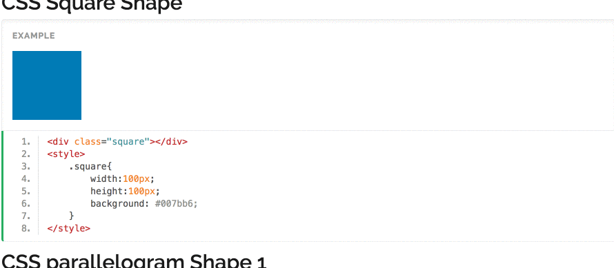
CSS Square Shape
.square{
            width:100px;
            height:100px;
            background: #007bb6;
}
<div class="square"></div>
<style>
    .square{
        width:100px;
        height:100px;
        background: #007bb6;
    }
</style>
CSS parallelogram Shape 1
.parallelogram{
	        width:100px;
	        height:70px;
	        background: #007bb6;
	        -ms-transform: skew(20deg);
        transform-origin: 0% 100%;
}
CSS rectangle Shape
.rectangle{
        width:100px;
        height:60px;
        background: #dd4b39;
}
<div class="rectangle"></div>
<style>
    .rectangle{
        width:100px;
        height:60px;
        background: #dd4b39;
    }
</style>
CSS trapez Shape Top
.trapez{
        height: 0;
        width:200px;
        border-bottom: 100px solid blue;
        border-left: 60px solid transparent;
        border-right: 60px solid transparent;
}
<div class="trapez"></div>
<style>
    .trapez{
        height: 0;
        width:200px;
        border-bottom: 100px solid blue;
        border-left: 60px solid transparent;
        border-right: 60px solid transparent;
    }
</style>
CSS trapez Shape Bottom
.trapez2{
        height: 0;
        width:200px;
        border-top: 100px solid blue;
        border-left: 60px solid transparent;
        border-right: 60px solid transparent;
}
<div class="trapez2"></div>
<style>
    .trapez2{
        height: 0;
        width:200px;
        border-top: 100px solid blue;
        border-left: 60px solid transparent;
        border-right: 60px solid transparent;
    }
</style>
CSS trapez Shape Left
.trapez3{
        height: 200px;
        width:0;
        border-right: 100px solid blue;
        border-top: 60px solid transparent;
        border-bottom: 60px solid transparent;
}
<div class="trapez3"></div>
<style>
    .trapez3{
        height: 200px;
        width:0;
        border-right: 100px solid blue;
        border-top: 60px solid transparent;
        border-bottom: 60px solid transparent;
    }
</style>
CSS trapez Shape Right
.trapez4{
        height: 200px;
        width:0;
        border-left: 100px solid blue;
        border-top: 60px solid transparent;
        border-bottom: 60px solid transparent;
}
<div class="trapez4"></div>
<style>
    .trapez4{
        height: 200px;
        width:0;
        border-left: 100px solid blue;
        border-top: 60px solid transparent;
        border-bottom: 60px solid transparent;
    }
</style>
CSS Triangle Up Shape
.triangleup{
        height: 0;
        width:0;
        border-left: 50px solid transparent;
        border-right: 50px solid transparent;
        border-bottom: 100px solid red;
}
<div class="triangleup"></div>
<style>
    .triangleup{
        height: 0;
        width:0;
        border-left: 50px solid transparent;
        border-right: 50px solid transparent;
        border-bottom: 100px solid red;
    }
</style>
CSS Triangle Right Shape
.triangleright{
        height: 0;
        width:0;
        border-left: 100px solid red;
        border-top: 50px solid transparent;
        border-bottom: 50px solid transparent;
}
<div class="triangleright"></div>
<style>
    .triangleright{
        height: 0;
        width:0;
        border-left: 100px solid red;
        border-top: 50px solid transparent;
        border-bottom: 50px solid transparent;
    }
</style>
CSS Triangle Down Shape
.triangledown{
        height: 0;
        width:0;
        border-left: 50px solid transparent;
        border-top: 100px solid red;
        border-right: 50px solid transparent;
}
<div class="triangledown"></div>
<style>
    .triangledown{
        height: 0;
        width:0;
        border-left: 50px solid transparent;
        border-top: 100px solid red;
        border-right: 50px solid transparent;
    }
</style>
CSS Triangle Left Shape
.triangleleft{
        height: 0;
        width:0;
        border-bottom: 50px solid transparent;
        border-top: 50px solid transparent;
        border-right: 100px solid red;
}
<div class="triangleleft"></div>
<style>
    .triangleleft{
        height: 0;
        width:0;
        border-bottom: 50px solid transparent;
        border-top: 50px solid transparent;
        border-right: 100px solid red;
    }
</style>
CSS Half Circle Top Shape
.halfcircletop{
        height: 45px;
        width:90px;
        background: gray;
        -moz-border-radius: 90px 90px 0 0;
        -webkit-border-radius: 90px 90px 0 0;
        -o-border-radius: 90px 90px 0 0;
        border-radius: 90px 90px 0 0;
}
<div class="halfcircletop"></div>
<style>
    .halfcircletop{
        height: 45px;
        width:90px;
        background: gray;
        -moz-border-radius: 90px 90px 0 0;
        -webkit-border-radius: 90px 90px 0 0;
        -o-border-radius: 90px 90px 0 0;
        border-radius: 90px 90px 0 0;
    }
</style>
CSS Half Circle Right Shape
.halfcircleright{
        height: 90px;
        width:45px;
        background: gray;
        -moz-border-radius: 0 90px 90px 0;
        -webkit-border-radius: 0 90px 90px 0;
        -o-border-radius: 0 90px 90px 0;
        border-radius: 0 90px 90px 0;
}
<div class="halfcircleright"></div>
<style>
    .halfcircleright{
        height: 90px;
        width:45px;
        background: gray;
        -moz-border-radius: 0 90px 90px 0;
        -webkit-border-radius: 0 90px 90px 0;
        -o-border-radius: 0 90px 90px 0;
        border-radius: 0 90px 90px 0;
    }
</style>
CSS Half Circle Bottom Shape
.halfcirclebottom{
        height: 45px;
        width:90px;
        background: gray;
        -moz-border-radius: 0 0 90px 90px;
        -webkit-border-radius: 0 0 90px 90px;
        -o-border-radius: 0 0 90px 90px;
        border-radius: 0 0 90px 90px;
}
<div class="halfcirclebottom"></div>
<style>
    .halfcirclebottom{
        height: 45px;
        width:90px;
        background: gray;
        -moz-border-radius: 0 0 90px 90px;
        -webkit-border-radius: 0 0 90px 90px;
        -o-border-radius: 0 0 90px 90px;
        border-radius: 0 0 90px 90px;
    }
</style>
CSS Half Circle Left Shape
.halfcircleleft{
        height: 90px;
        width:45px;
        background: gray;
        -moz-border-radius: 90px 0 0 90px;
        -webkit-border-radius: 90px 0 0 90px;
        -o-border-radius: 90px 0 0 90px;
        border-radius: 90px 0 0 90px;
}
<div class="halfcircleleft"></div>
<style>
    .halfcircleleft{
        height: 90px;
        width:45px;
        background: gray;
        -moz-border-radius: 90px 0 0 90px;
        -webkit-border-radius: 90px 0 0 90px;
        -o-border-radius: 90px 0 0 90px;
        border-radius: 90px 0 0 90px;
    }
</style>
CSS Circle Shape
.circle{
        height: 90px;
        width:90px;
        background: #03A9F4;
        -moz-border-radius: 90px;
        -webkit-border-radius: 90px;
        -o-border-radius: 90px;
        border-radius: 90px;
}
<div class="circle"></div>
<style>
    .circle{
        height: 90px;
        width:90px;
        background: #03A9F4;
        -moz-border-radius: 90px;
        -webkit-border-radius: 90px;
        -o-border-radius: 90px;
        border-radius: 90px;
    }
</style>
CSS Oval horizontal Shape
.ovalhorizontal{
        height: 90px;
        width:180px;
        background: #03A9F4;
        -moz-border-radius: 90px/45px;
        -webkit-border-radius: 90px/45px;
        -o-border-radius: 90px/45px;
        border-radius: 90px/45px;
}
<div class="ovalhorizontal"></div>
<style>
    .ovalhorizontal{
        height: 90px;
        width:180px;
        background: #03A9F4;
        -moz-border-radius: 90px/45px;
        -webkit-border-radius: 90px/45px;
        -o-border-radius: 90px/45px;
        border-radius: 90px/45px;
    }
</style>
CSS Oval Vertical Shape
.ovalvertical{
        height: 180px;
        width:90px;
        background: #03A9F4;
        -moz-border-radius: 45px/90px;
        -webkit-border-radius: 45px/90px;
        -o-border-radius: 45px/90px;
        border-radius: 45px/90px;
}
<div class="ovalvertical"></div>
<style>
    .ovalvertical{
        height: 180px;
        width:90px;
        background: #03A9F4;
        -moz-border-radius: 45px/90px;
        -webkit-border-radius: 45px/90px;
        -o-border-radius: 45px/90px;
        border-radius: 45px/90px;
    }
</style>
CSS half quarter circle top left Shape
.halfquartercircletopleft{
        height: 90px;
        width:90px;
        background: #4CAF50;
        -moz-border-radius: 90px 0 0 0;
        -webkit-border-radius: 90px 0 0 0;
        -o-border-radius: 90px 0 0 0;
        border-radius: 90px 0 0 0;
}
<div class="halfquartercircletopleft"></div>
<style>
    .halfquartercircletopleft{
        height: 90px;
        width:90px;
        background: #4CAF50;
        -moz-border-radius: 90px 0 0 0;
        -webkit-border-radius: 90px 0 0 0;
        -o-border-radius: 90px 0 0 0;
        border-radius: 90px 0 0 0;
    }
</style>
CSS half quarter circle top right Shape
.halfquartercircletopright{
        height: 90px;
        width:90px;
        background: #4CAF50;
        -moz-border-radius: 0 90px 0 0;
        -webkit-border-radius: 0 90px 0 0;
        -o-border-radius: 0 90px 0 0;
        border-radius: 0 90px 0 0;
}
<div class="halfquartercircletopright"></div>
<style>
    .halfquartercircletopright{
        height: 90px;
        width:90px;
        background: #4CAF50;
        -moz-border-radius: 0 90px 0 0;
        -webkit-border-radius: 0 90px 0 0;
        -o-border-radius: 0 90px 0 0;
        border-radius: 0 90px 0 0;
    }
</style>
CSS half quarter circle bottom right Shape
.halfquartercirclebottomright{
        height: 90px;
        width:90px;
        background: #4CAF50;
        -moz-border-radius: 0 0 90px 0;
        -webkit-border-radius: 0 0 90px 0;
        -o-border-radius: 0 0 90px 0;
        border-radius: 0 0 90px 0;
}
<div class="halfquartercirclebottomright"></div>
<style>
    .halfquartercirclebottomright{
        height: 90px;
        width:90px;
        background: #4CAF50;
        -moz-border-radius: 0 0 90px 0;
        -webkit-border-radius: 0 0 90px 0;
        -o-border-radius: 0 0 90px 0;
        border-radius: 0 0 90px 0;
    }
</style>
CSS half quarter circle bottom left Shape
.halfquartercirclebottomleft{
        height: 90px;
        width:90px;
        background: #4CAF50;
        -moz-border-radius: 0 0 0 90px;
        -webkit-border-radius: 0 0 0 90px;
        -o-border-radius: 0 0 0 90px;
        border-radius: 0 0 0 90px;
}
<div class="halfquartercirclebottomleft"></div>
<style>
    .halfquartercirclebottomleft{
        height: 90px;
        width:90px;
        background: #4CAF50;
        -moz-border-radius: 0 0 0 90px;
        -webkit-border-radius: 0 0 0 90px;
        -o-border-radius: 0 0 0 90px;
        border-radius: 0 0 0 90px;
    }
</style>
CSS Chart top Shape
.charttop{
        height: 0;
        width:0;
        border: 60px solid #FFC107;
        border-top: 60px solid transparent;
        -moz-border-radius: 60px;
        -webkit-border-radius: 60px;
        -o-border-radius: 60px;
        border-radius: 60px;
}
<div class="charttop"></div>
<style>
    .charttop{
        height: 0;
        width:0;
        border: 60px solid #FFC107;
        border-top: 60px solid transparent;
        -moz-border-radius: 60px;
        -webkit-border-radius: 60px;
        -o-border-radius: 60px;
        border-radius: 60px;
    }
</style>
CSS Chart Right Shape
.chartright{
        height: 0;
        width:0;
        border: 60px solid #FFC107;
        border-right: 60px solid transparent;
        -moz-border-radius: 60px;
        -webkit-border-radius: 60px;
        -o-border-radius: 60px;
        border-radius: 60px;
}
<div class="chartright"></div>
<style>
    .chartright{
        height: 0;
        width:0;
        border: 60px solid #FFC107;
        border-right: 60px solid transparent;
        -moz-border-radius: 60px;
        -webkit-border-radius: 60px;
        -o-border-radius: 60px;
        border-radius: 60px;
    }
</style>
CSS Chart Bottom Shape
.chartbottom{
        height: 0;
        width:0;
        border: 60px solid #FFC107;
        border-bottom: 60px solid transparent;
        -moz-border-radius: 60px;
        -webkit-border-radius: 60px;
        -o-border-radius: 60px;
        border-radius: 60px;
}
<div class="chartbottom"></div>
<style>
    .chartbottom{
        height: 0;
        width:0;
        border: 60px solid #FFC107;
        border-bottom: 60px solid transparent;
        -moz-border-radius: 60px;
        -webkit-border-radius: 60px;
        -o-border-radius: 60px;
        border-radius: 60px;
    }
</style>
CSS Chart Left Shape
.chartleft{
        height: 0;
        width:0;
        border: 60px solid #FFC107;
        border-left: 60px solid transparent;
        -moz-border-radius: 60px;
        -webkit-border-radius: 60px;
        -o-border-radius: 60px;
        border-radius: 60px;
}
<div class="chartleft"></div>
<style>
    .chartleft{
        height: 0;
        width:0;
        border: 60px solid #FFC107;
        border-left: 60px solid transparent;
        -moz-border-radius: 60px;
        -webkit-border-radius: 60px;
        -o-border-radius: 60px;
        border-radius: 60px;
    }
</style>
CSS heart Shape
.heart{
        background-color: red;
        display: inline-block;
        height: 100px;
        margin: 32px 52px;
        position: relative;
        top: 0;
        -webkit-transform: rotate(-45deg);
        -moz-transform: rotate(-45deg);
        -ms-transform: rotate(-45deg);
        -o-transform: rotate(-45deg);
        transform: rotate(-45deg);
        width: 100px;
} .heart:before,.heart:after{
        content: "";
        background-color: red;
        border-radius: 50%;
        height: 100px;
        position: absolute;
        width: 100px;
} .heart:before{
        top: -42px;
        left: 0;
} .heart:after{
        left: 42px;
        top: 0;
}
<div class="heart"></div>
<style>
    .heart{
        background-color: red;
        display: inline-block;
        height: 100px;
        margin: 0 10px;
        position: relative;
        top: 0;
        -webkit-transform: rotate(-45deg);
        -moz-transform: rotate(-45deg);
        -ms-transform: rotate(-45deg);
        -o-transform: rotate(-45deg);
        transform: rotate(-45deg);
        width: 100px;
    }
    .heart:before,.heart:after{
        content: "";
        background-color: red;
        border-radius: 50%;
        height: 100px;
        position: absolute;
        width: 100px;
    }
    .heart:before{
        top: -42px;
        left: 0;
    }
    .heart:after{
        left: 42px;
        top: 0;
    }
</style>
CSS Triangle up Left Shape
.triangleupLeft{
        height: 0;
        width:0;
        border-top: 50px solid #795548;
        border-left: 50px solid #795548;
        border-right: 50px solid transparent;
        border-bottom: 50px solid transparent;
}
<div class="triangleupLeft"></div>
<style>
    .triangleupLeft{
        height: 0;
        width:0;
        border-top: 50px solid #795548;
        border-left: 50px solid #795548;
        border-right: 50px solid transparent;
        border-bottom: 50px solid transparent;
    }
</style>
CSS Triangle up Right Shape
.triangleupright{
        height: 0;
        width:0;
        border-top: 50px solid #795548;
        border-left: 50px solid transparent;
        border-right: 50px solid #795548;
        border-bottom: 50px solid transparent;
}
<div class="triangleupright"></div>
<style>
    .triangleupright{
        height: 0;
        width:0;
        border-top: 50px solid #795548;
        border-left: 50px solid transparent;
        border-right: 50px solid #795548;
        border-bottom: 50px solid transparent;
    }
</style>
CSS Triangle Bottom Right Shape
.trianglebottomright{
        height: 0;
        width:0;
        border-top: 50px solid transparent;
        border-left: 50px solid transparent;
        border-right: 50px solid #795548;
        border-bottom: 50px solid #795548;
}
<div class="trianglebottomright"></div>
<style>
    .trianglebottomright{
        height: 0;
        width:0;
        border-top: 50px solid transparent;
        border-left: 50px solid transparent;
        border-right: 50px solid #795548;
        border-bottom: 50px solid #795548;
    }
</style>
CSS Triangle Bottom Left Shape
.trianglebottomleft{
        height: 0;
        width:0;
        border-top: 50px solid transparent;
        border-left: 50px solid #795548;
        border-right: 50px solid transparent;
        border-bottom: 50px solid #795548;
}
<div class="trianglebottomleft"></div>
<style>
    .trianglebottomleft{
        height: 0;
        width:0;
        border-top: 50px solid transparent;
        border-left: 50px solid #795548;
        border-right: 50px solid transparent;
        border-bottom: 50px solid #795548;
    }
</style>
CSS Bookmark Ribbon Shape
.bookmarkribbon{
        height: 0;
        width:0;
        border-top: 50px solid #03a9f4;
        border-left: 50px solid #03a9f4;
        border-right: 50px solid #03a9f4;
        border-bottom: 50px solid transparent;
}
<div class="bookmarkribbon"></div>
<style>
    .bookmarkribbon{
        height: 0;
        width:0;
        border-top: 50px solid #03a9f4;
        border-left: 50px solid #03a9f4;
        border-right: 50px solid #03a9f4;
        border-bottom: 50px solid transparent;
    }
</style>
CSS Funky Hour Glasses Shape
.funkyhourglasses{
        width: 64px;
        height: 100px;
        background-color: #7de3f5;
        position: relative;
        overflow: hidden;
} .funkyhourglasses:before {
        content: "";
        width: 0;
        height: 0;
        display: block;
        position: absolute;
        z-index: 30;
        border-top: 50px solid transparent;
        border-bottom: 50px solid transparent;
        border-left: 30px solid #ffffff;
} .funkyhourglasses:after {
        content: "";
        width: 0;
        height: 0;
        right: 0;
        display: block;
        position: absolute;
        z-index: 30;
        border-top: 50px solid transparent;
        border-bottom: 50px solid transparent;
        border-right: 30px solid #ffffff;
}
<div class="funkyhourglasses"></div>
<style>
    .funkyhourglasses{
        width: 64px;
        height: 100px;
        background-color: #7de3f5;
        position: relative;
        overflow: hidden;
    }
    .funkyhourglasses:before {
        content: "";
        width: 0;
        height: 0;
        display: block;
        position: absolute;
        z-index: 30;
        border-top: 50px solid transparent;
        border-bottom: 50px solid transparent;
        border-left: 30px solid #ffffff;
    }
    .funkyhourglasses:after {
        content: "";
        width: 0;
        height: 0;
        right: 0;
        display: block;
        position: absolute;
        z-index: 30;
        border-top: 50px solid transparent;
        border-bottom: 50px solid transparent;
        border-right: 30px solid #ffffff;
    }
</style>